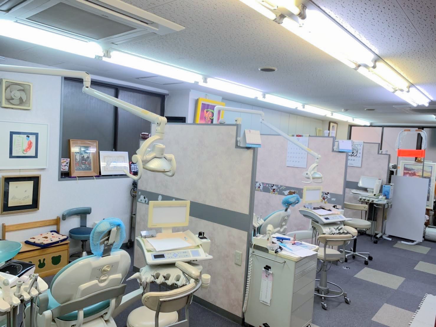
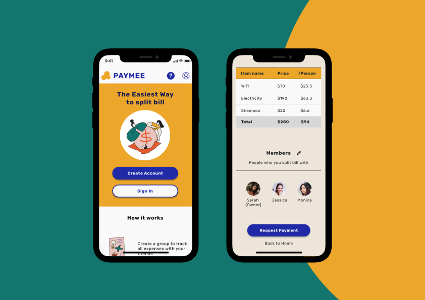
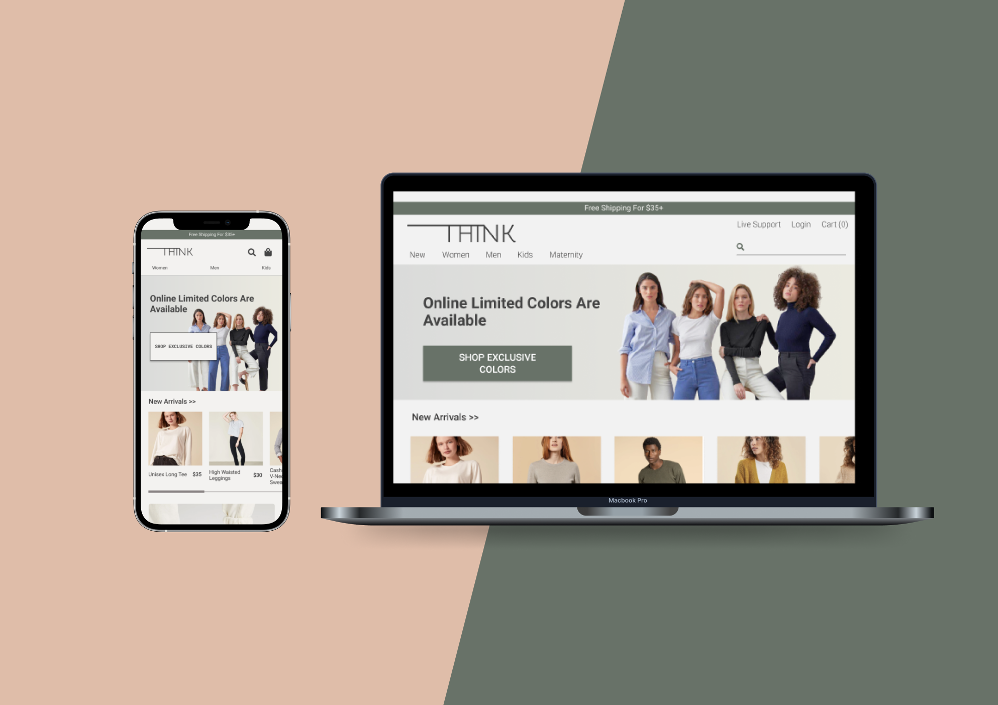
local orthodontic office
designing Online appointment system
About the project
May You Orthodontic Office is a local orthodontist in Japan with 30+ years history. I designed their official website and online appointment system so that they can attract new patients. 15% of their patients are English speakers because Dr. Chen used to teach in NYC. I helped launching an English website. I focused on mobile experience based on the Google Analytics data that over 80% traffic are mobile.
| Client | : | May You Orthodontic Office |
| Role | : | Branding, UI/UX design, Research |
| Duration | : | 4 weeks |
| Tools | : | Figma, Whimsical, Photoshop, Illustrator |
The Challenge
- Users compare many websites before deciding orthodontists.
- May You Orthodontic Offices missed lots of opportunities because they didn’t have an official website and online appointment system.
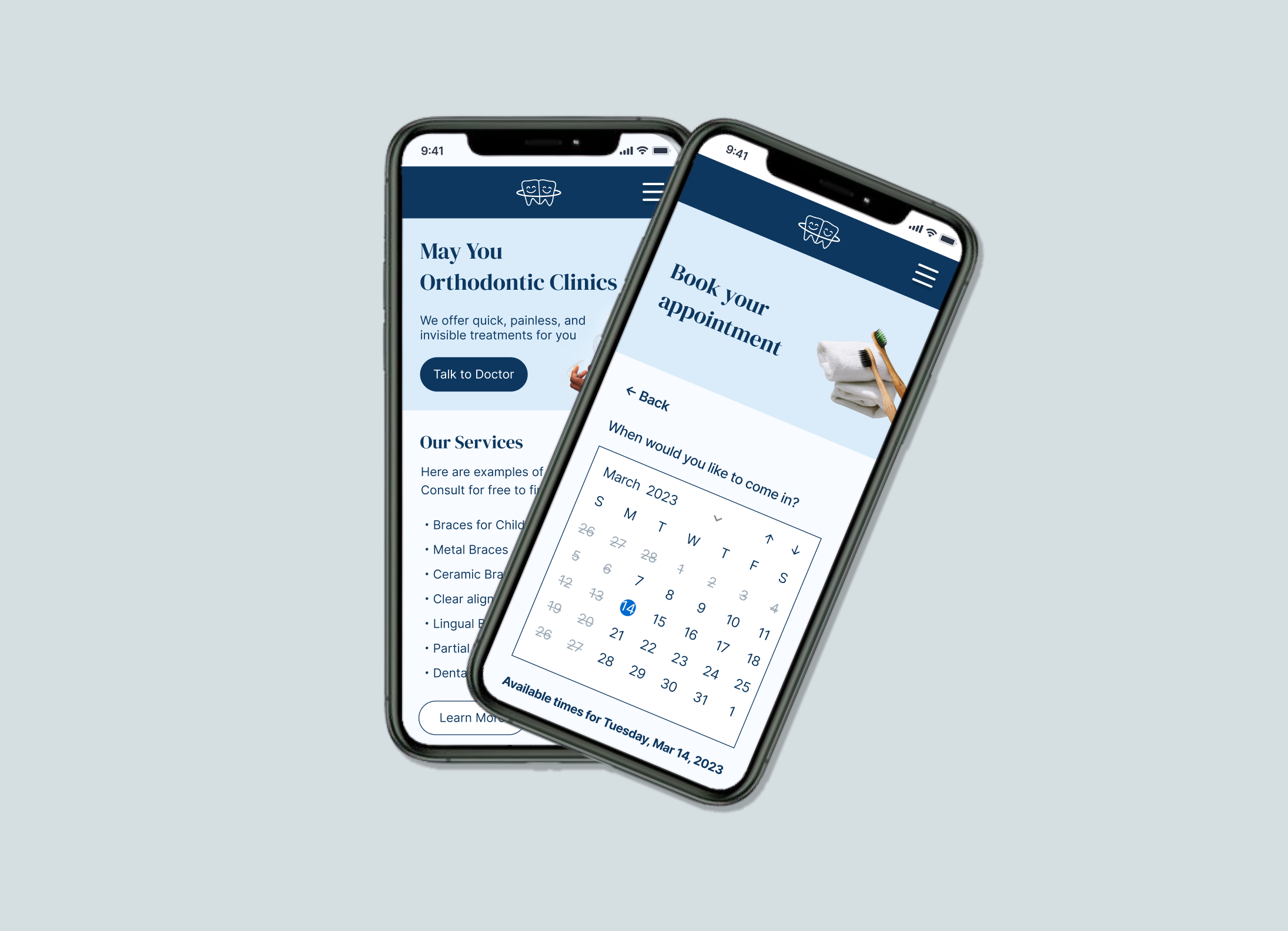
The solution
I designed their official website and online appointment system. I also helped their branding so that they can differentiate from competitors around the clinic.
Here’s how i solved the problem
RESEARCH
Most users want to make appointments online. They research a lot before deciding orthodontists.
Interview with people who had got braces before
I conducted interviews with 4 people who have got braces/Invisalign before.
Interestingly, all interviewees prefer online appointments. In Japan, it’s common to get first braces while working. These adult patients are busy to make phone calls on weekdays. Also they are scared of being asked unfamiliar questions on call because they have no ideas about orthodontics.

Persona
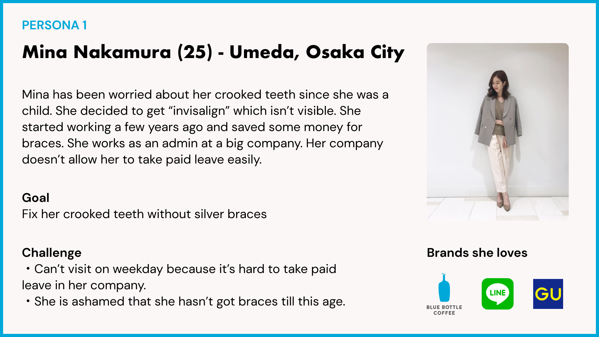
I created a persona based on the user interview. Japan has a unique culture that lots of people get their first braces after they start working.
Problem Statement is “Mina Nakamura is hesitant to make a phone call to orthodontist because she is not familiar with braces and very busy for work.“
User Survey
In order to prioritize information on the website, I ran an online survey among people who have visited orthodontic clinics before. I used MaxDiff Analysis to understand which information new patients are looking for. MaxDiff Analysis is an analytic approach used to gauge survey respondents’ preference score for different items. I asked respondents to pick the most and least important item when they choose an orthodontic.
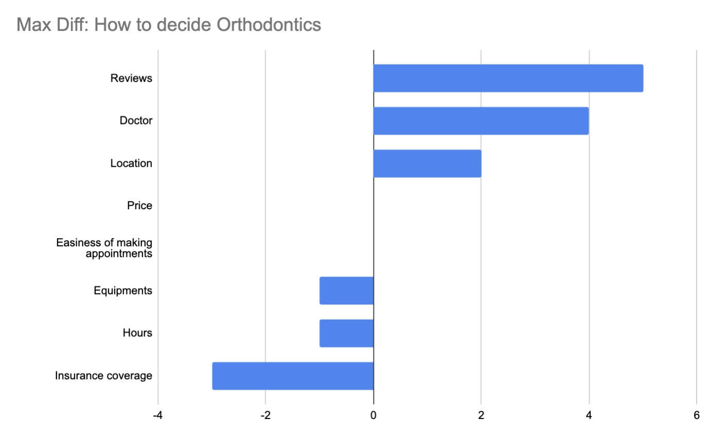
Answers vary depending on person, but here are interesting findings:
- People don’t care about cost and insurance when they find orthodontics. Some of them mentioned that “Price may be correlated with their quality”.
- Reviews are important. They read reviews because they don’t know how to decide orthodontists. Some people mentioned that “I read reviews in order to understand what could be a complaint. I didn’t know that some orthodontists prefer extracting teeth vs others didn’t.”
BRANDING
How might we differentiate from other clinics?
Competitor Analysis
I interviewed Dr. Ming Yu who is the owner of the clinic. He told me that how much competition has been increased recently. Other clinics have lots of new machines that his clinic doesn’t have.
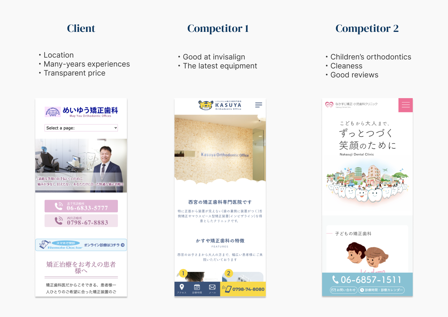
I did a competitor analysis to understand his clinic’s core value.
His values are:
・Location (The clinic is located inside a big station)
・The knowledge and experience he has cultivated over many years
・Transparent price setting
These 3 core values align with our persona who is very busy for work (good location helps it) and hesitate to go to orthodontists due to her lack of knowledge (doctor’s knowledge and transparent price help it).
Brand Palette
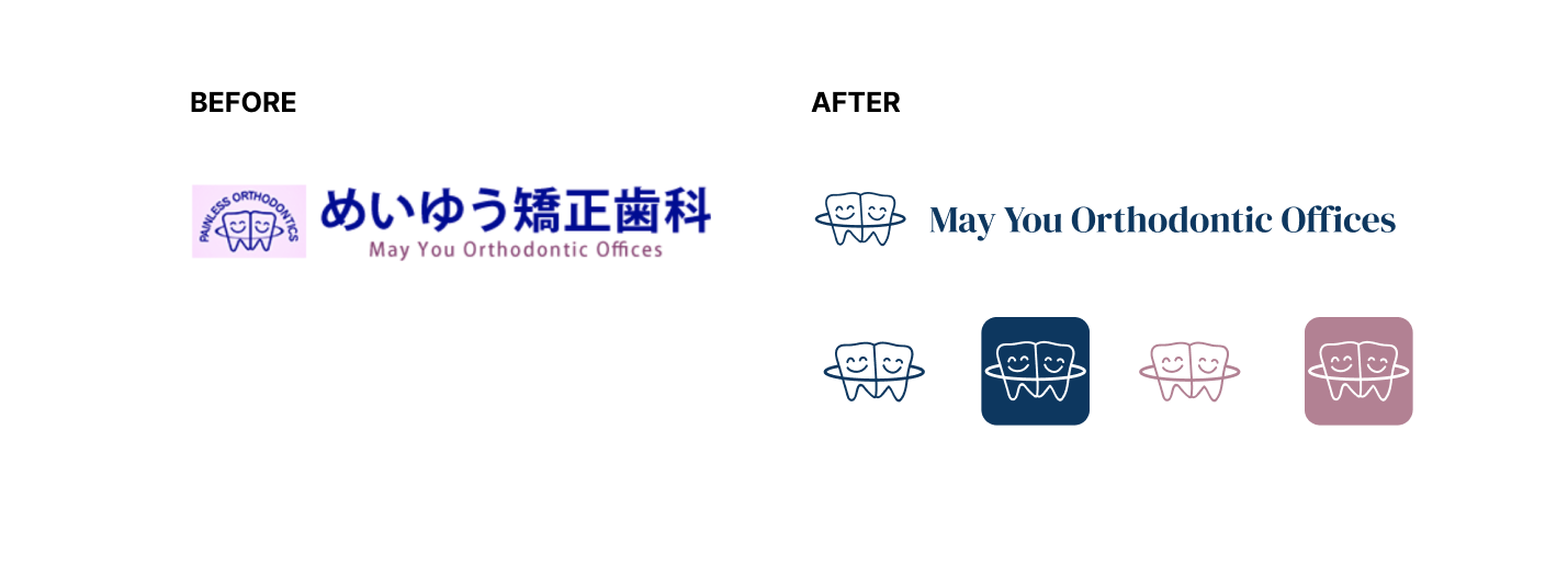
Their original logo mixes Japanese characters and English. I simplified the logo and created an icon so that they can use it for small spaces.
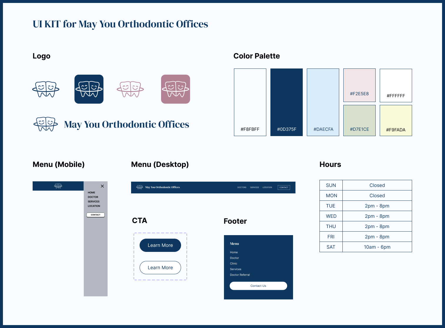
Current website didn’t have a color palette and it was hard to emphasize important information and CTA. I created a color palette with navy blue because they used it in their logo. Their website used lots of different pink colors and I reduced the usage of pink because a monochromatic color scheme with blue brings more “cleanness” and “trustworthy”. I made a UI kit so that they can keep the consistent brand.
IDEATION
ONLINE appointment system and website showing thier value prop at a glance
Site Map
They have asked a local agency to create a website in the past, but the navigation was very complicated. I made a site map to simplify information.
BEFORE

AFTER

Usability Test with Wireframe
I created a wireframe for quick test.
Users were confused by the home page having the clinic location and contact button upfront. They said they would see if the clinic provides the invisalign or braces, then check the clinic location. Thus I redesigned the home page as below.
BEFORE

AFTER

The homepage was redesigned with the new branding elements and site map as below.
BEFORE

AFTER

Hi-Fi Prototype
Primary tasks are
(1) to decide if they want to make the first appointment or not by browsing the website
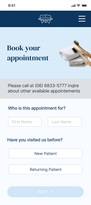
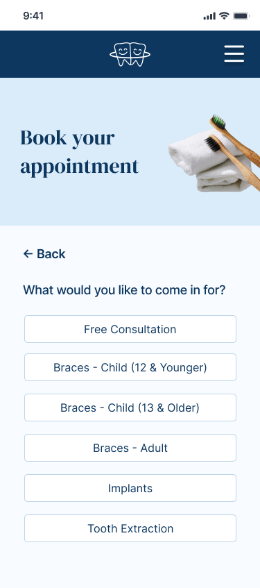
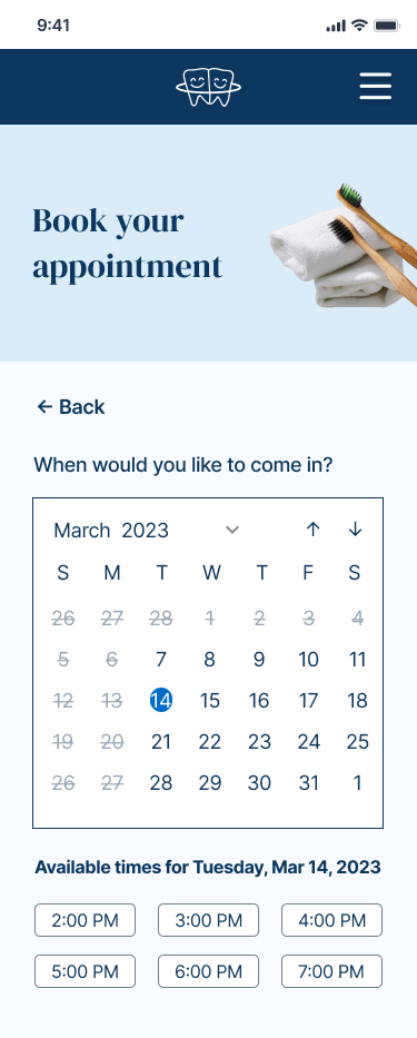
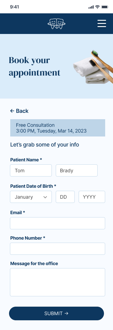
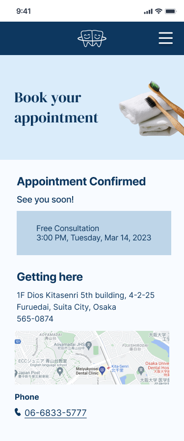
(2) to make an appointment via online form.
All participants at the user testing could complete both tasks.
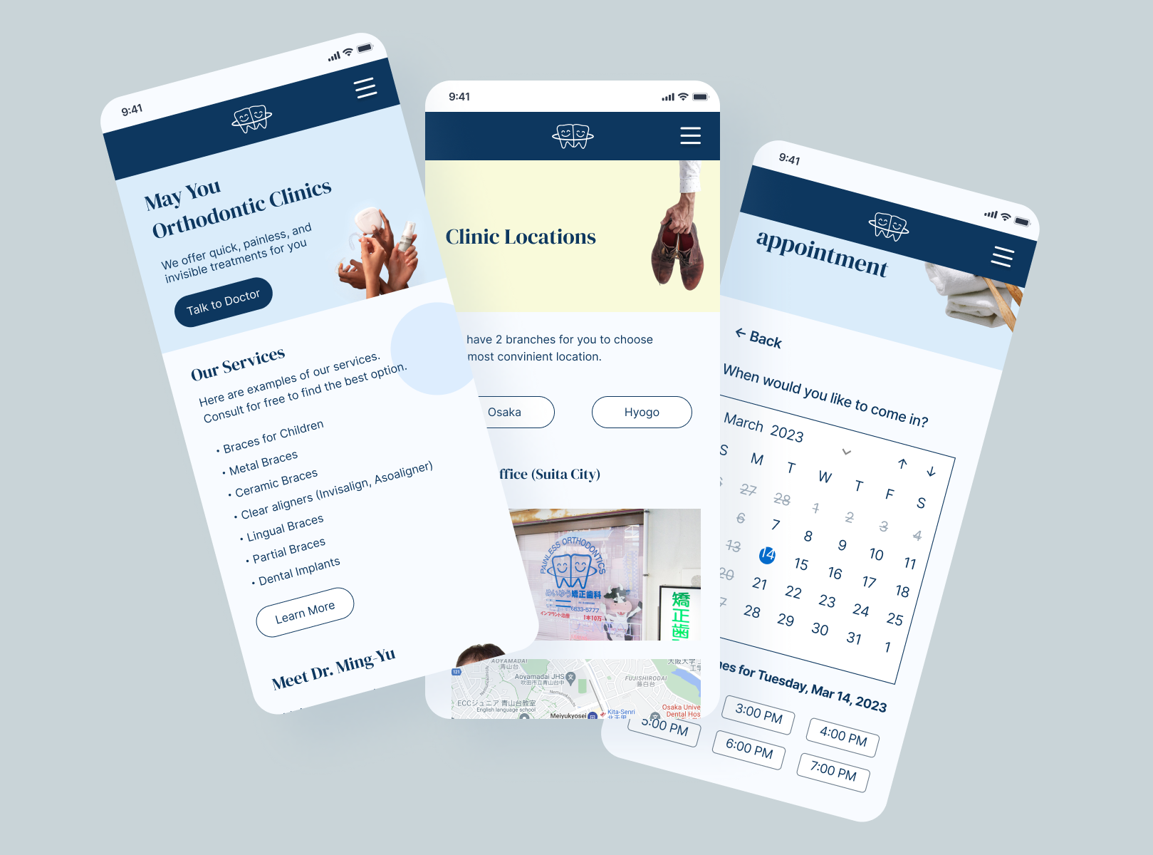
Online appointment system
TAKEAWAYS
Many people were confused by orthodontics and dental clinics in Japan. However there are many differences when it comes to designing these website.
- Most website visitors are new patients on orthodontics websites while dental clinics need to consider repeaters.
- Selecting orthodontics is more similar to choosing hair salons than dental clinics. Patients take lots of time to look for ideal solutions.
I could simplify the website, but there are some people who feel more welcoming when the website has more details. If I had time, I would find the balance between simple enough and friendly enough.
